Change Default SharePoint Site Logo CSS Trick – Great for Office 365!

I was just thinking about this issue one day and realized that I could just override the default image but if the user decides that they wanted to change it later via site settings they could.

Why do I love this trick?

  1. You don’t have to set a Site Logo via Site Settings > Title, description, and logo
    1. For On-Prem solutions I would set this via code
    2. For Office 365 you would typically have to do this manually OR powershell to set it across
  2. It’s pure CSS trickery, no change to any markup!
    1. This will work across the board On-Prem/Office 365…. No code….
  3. Manually setting the Logo you can override this trick
    1. For those subsites that don’t want to inherit the logo they can manually set the logo via the Site Settings > Title, description, and logo
    2. Once the logo is set in the default it will override this trick

Get to the trick already!!!!

Add the following lines of CSS. Only a couple of notes to make this actually work.

img[src*='siteIcon'] { 

display: block; 

-moz-box-sizing: border-box; 

box-sizing: border-box; 

background: url(‘/Style Library/mySiteLogo.png’) no-repeat; /* Path to the site logo */ 

width: 180px; /* Width of new image */ 

height: 236px; /* Height of new image */ 

padding-left: 180px; /* Equal to width of new image */ 

} 

.ms-siteicon-img, .ms-siteicon-a { 

max-height: none; 

max-width: none; 

} 

Only 2 important detail for this trick to work.

  1. You must set the actual image size must equal the information above for this trick to work.
  2. DON’T use ‘siteIcon’ in the filename.

How does this work?

This trick works because it uses CSS to catch onto the <img/> field where the ‘src’ contains ‘siteIcon’. This case catches both the themed site icon on the publishing site and the site icon on the team site. The CSS that performs the replacement of the image comes from https://css-tricks.com/replace-the-image-in-an-img-with-css/ by Marcel Shields. You can read more about that there.

  • Publishing Site Logo

clip_image002

  • Team Site Logo

clip_image004

Hide Newsfeed, OneDrive and/or Sites from the Suite Bar – Ribbon Area for SharePoint 2013

It really is super simple and requires I line of CSS per item. If you want to hit them all or any future ones you could hide the whole element. I’m posting this b/c I was looking for a quick fix to do this and all the blogs make you change master pages or something else wacky. I didn’t have mine enabled and really was being lazy. So here it is.

Hide OneDrive

#suiteLinksBox .ms-core-suiteLink-a[id$=’ShellDocuments’] {

display: none;

}

Hide Newsfeeds 

#suiteLinksBox .ms-core-suiteLink-a[id$=’ShellNewsfeed’] {

display: none;

}

Hide Sites

#suiteLinksBox .ms-core-suiteLink-a[id$=’ShellSites’] {

display: none;

}

Get rid of them all in one shot

#suiteLinksBox .ms-core-suiteLink-a[id$=’ShellDocuments’],

#suiteLinksBox .ms-core-suiteLink-a[id$=’ShellNewsfeed’],

#suiteLinksBox .ms-core-suiteLink-a[id$=’ShellSites’] {

display: none;

}

Get rid of the anything that could possible go in there 

#suiteLinksBox {

display: none;

}


There you have it folks – simple css to just pop those items right off the page.

Bootstrap Navigation for Office 365 & SharePoint 2013 using jQuery and REST

Introduction

In my last post I talked about making the SharePoint navigation render in a Bootstrap friendly way. I suggested that you could do this by changing the markup of the navigation using an ASP:Repeater to display the nodes. This works great if you’re on an on-prem environment but on Office 365 you cannot use this method because the masterpage cannot contain code blocks. If you haven’t read that it might be worth taking a look at – Bootstrap Responsive Navigation in SharePoint .

This post will demonstrate an Office 365 safe version that use JavaScript, jQuery, and REST to retrieve the navigation from SharePoint’s navigation provider. Once we have that we’ll render that out to the screen client side. With this approach we can use the out of the box Managed Meta Data navigation provider for the navigation, and we can control the exact rendering so that it fits Bootstrap’s model for a navigation bar.

The code can be downloaded directly from my git-hub account – https://github.com/tom-daly/sp2013-bootstrap-nav

Getting Started

It’s very simple to get started you only need to do a few things.

  1. Add the link to the topNavigation.js in your SharePoint masterpage

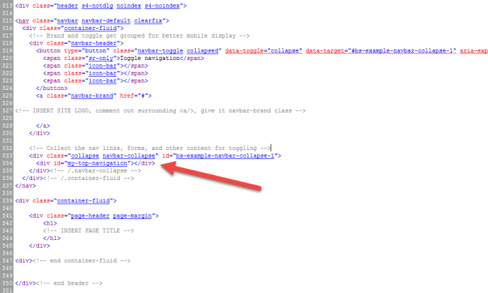
  1. In the Master Page, add the container below where the navigation will be pushed into. You will need to determine where you want the navigation to go, I’ll have a full example at the very end.

  1. Switch the SharePoint Navigation to use the Managed Meta Data Navigation
    1. In Site Settings
    2. Look and Feel -> Navigation

Once you complete those steps you’ll have your navigation displayed in that container.

Other Details

Changing Rendering

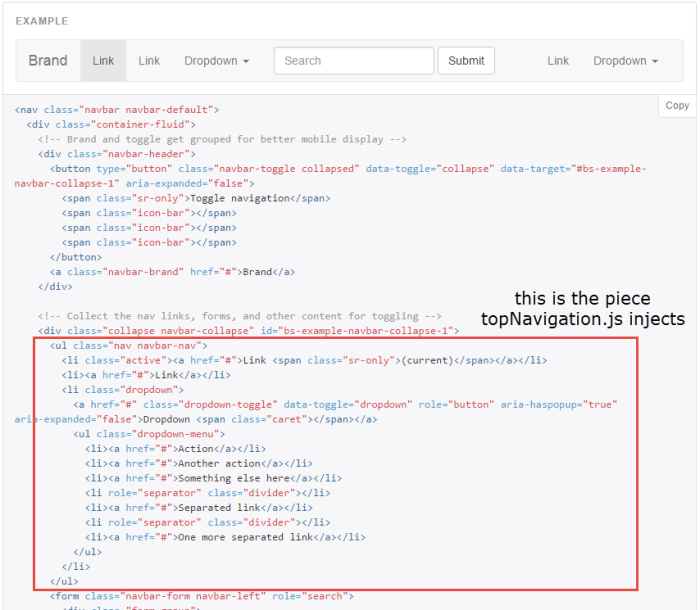
The rendering of the menu is defined in the renderNavigationNodes function. This is currently the format the Bootstrap likes. If you visit the Bootstrap website and take a look at the first example

http://getbootstrap.com/components/#navbar

The red box is exactly what the code is injecting. So you would wrap all that however you want it to appear. Follow the examples there are plenty out there.

2 Level Flyouts

Currently this supports only 2 levels, a top level and 1 flyout. This is just what Bootstrap v3.3.5 supports and that’s what I’m sticking with currently. If you want more levels then it’s up to you to figure that part out. It can be done and there are other 3rd parties implementing 3rd or 4th level flyouts after the fact. The code is recursive and will support as many levels as you have, you just need to handle the front end portion.

The REST Call

The query that I am using can be seen below. The /web/navigation/topbar endpoint – flat out sucks. It won’t show if a node is hidden and it didn’t behave. This is the only one I could get to work reliably.

Changing Target Container

If you want to change where the navigation goes, instead of “#my-top-navigation” then you can edit the topNavigation.js file and at the bottom change the selector to another ID preferably.

Sample Files

I have a few more sample files that might be of use to look at.

Base.css – Sample CSS file (helps with some Bootstrap/SharePoint resets)

Bootstrap.Master – Sample masterpage used in this example. In this sample I create my own header and not s4-titlerow. Using this html structure you’ll get the collapsible navigation that is popular on most web sites.

Conclusion

The whole goal of this script was to have a way for an Office 365 site to use the Bootstrap navigation. Although there are still limitations it’s doable. And you don’t even necessarily need to touch the master page. You could attach the scripts and css via other methods which I won’t go in to. So if you’re an Office 365 purist who doesn’t want to customize the master page you would want to take an approach to this. I hope this helps someone out there. If there are problems with the script you can report the issues through the github page. https://github.com/tom-daly/sp2013-bootstrap-nav/issues

Bootstrap Responsive Navigation in SharePoint

Introduction

Many of my most recent branding projects have all been responsive. Clients are building sites that they want to work on desktops, tablets, & phones. If you’ve ever tried to deal with this request and SharePoint is your platform then you know what a handful this can be. For all my responsive branding projects I always go to Bootstrap. If you don’t know what that is then this article is not for you. We will not going into the details of implementing Bootstrap or the issues / fixes to do that.  If you’re looking for cookie cutter bootstrap in SharePoint then I recommend that you check out Responsive SharePoint.

This article we will simply focus on the navigation. We will be replicating the standard out of the box (OOTB) SharePoint navigation and formatting it in a way that works with Bootstrap 3.0. I’ll provide you with the code snippet and an explanation of how to implement, and what is happening. It should leave you with the functionality of the Bootstrap’s collapsible navigation.

Our main problems with the SharePoint navigation are:

    • SharePoint out of the box navigation is NOT responsive
    • SharePoint out of the box navigation doesn’t work well with touch enabled devices
      • It has hover actions on the navigation, and hover doesn’t work on touch devices

b

Prerequisites

The following need to be reference in your site.

  • jQuery
  • Bootstrap 3.0
  • On-Prem SharePoint environment w/ access to the Masterpage
    • You can see the references these in my master page

SORRY SharePoint Onliner’s and O365’s – this won’t work b/c you can’t use code blocks in the MasterPage

ref

The Navigation Code

You can view the html markup that Bootstrap requires in order to work properly – http://getbootstrap.com/components/#navbar . The OOTB SharePoint navigation does its own thing so it would never work with Bootstrap. In this approach we’ll use the SharePoint top navigation provider but we’ll create our own navigation markup using asp repeaters. The following code will only work for 2 levels deep, it could be modified to work on X number of levels. You would just have to keep nesting repeaters. I am using ASP repeaters in the master page with no code behind in this approach. If you wanted to you could write a user control and simplify what goes into the master page but for me no C# code means less things that could break. There is one minor issue with this approach – see the Known Issues section.

Download Snippet Here

1 <nav class=”navbar navbar-default s4-notdlg noindex s4-noindex”> 2 <div class=”container”> 3 <!– Brand and toggle get grouped for better mobile display –> 4 <div class=”navbar-header”> 5 <button type=”button” class=”navbar-toggle collapsed” data-toggle=”collapse” data-target=”#bs-example-navbar-collapse-1″ aria-expanded=”false”> 6 <span class=”sr-only”>Toggle navigation</span> 7 <span class=”icon-bar”></span> 8 <span class=”icon-bar”></span> 9 <span class=”icon-bar”></span> 10 </button> 11 <SharePoint:SPLinkButton runat=”server” NavigateUrl=”~sitecollection/” ID=”onetidProjectPropertyTitleGraphic” CssClass=”navbar-brand”> 12 <SharePoint:SiteLogoImage name=”onetidHeadbnnr0″ ID=”onetidHeadbnnr2″ LogoImageUrl=”images/logo.png” runat=”server”></SharePoint:SiteLogoImage> 13 </SharePoint:SPLinkButton> 14 </div> 15 16 <div class=”collapse navbar-collapse” id=”bs-example-navbar-collapse-1″> 17 18 <asp:Repeater runat=”server” ID=”TopNavMenu” DataSourceID=”topSiteMap”> 19 <HeaderTemplate> 20 <ul class=”nav navbar-nav navbar-right”> 21 </HeaderTemplate> 22 <ItemTemplate> 23 <li runat=”server” class=”root-node”> 24 <a href=”<%# Eval(“Url”) %>“> 25 <%# Eval(Title) %> 26 </a> 27 </li> 28 <asp:Repeater runat=”server” ID=”FirstLevelNodes” DataSource=”<%# ((SiteMapNode)Container.DataItem).ChildNodes %>”> 29 <ItemTemplate> 30 <!– if has children –> 31 <li runat=”server” visible=”<%# ((SiteMapNode) Container.DataItem).ChildNodes.Count > 0 %>” data-node-count=”<%# ((SiteMapNode)((RepeaterItem)Container.Parent.Parent).DataItem).ChildNodes.Count %>” data-node-index=”<%# Container.ItemIndex %>” class='<%# Container.ItemIndex == ((SiteMapNode)((RepeaterItem)Container.Parent.Parent).DataItem).ChildNodes.Count-1 ? “dropdown last-node nav-node” : (Container.ItemIndex == 0 ? “dropdown first-node nav-node” : “dropdown nav-node”) %>‘> 32 <a href=”<%# Eval(“Url”) %>” class=”dropdown-toggle” data-toggle=”dropdown” role=”button” aria-expanded=”false”> 33 <%# Eval(Title) %> 34 <span class=”caret”></span> 35 </a> 36 <asp:Repeater runat=”server” ID=”ChildMenuRepeater” DataSource=”<%# ((SiteMapNode)Container.DataItem).ChildNodes %>”> 37 <HeaderTemplate> 38 <ul class=”dropdown-menu” role=”menu”> 39 </HeaderTemplate> 40 <ItemTemplate> 41 <li data-node-index=”<%# Container.ItemIndex %>” class=’nav-node’> 42 <a href=”<%# Eval(“Url”) %>“> 43 <%# Eval(Title) %> 44 </a> 45 </li> 46 </ItemTemplate> 47 <FooterTemplate></ul></FooterTemplate> 48 </asp:Repeater> 49 </li> 50 <!– if has zero children –> 51 <li runat=”server” visible=”<%# ((SiteMapNode) Container.DataItem).ChildNodes.Count <= 0 %>” data-node-count=”<%# ((SiteMapNode)((RepeaterItem)Container.Parent.Parent).DataItem).ChildNodes.Count %>” data-node-index=”<%# Container.ItemIndex %>” class='<%# Container.ItemIndex == ((SiteMapNode)((RepeaterItem)Container.Parent.Parent).DataItem).ChildNodes.Count-1 ? “last-node nav-node” : (Container.ItemIndex == 0 ? “first-node nav-node” : “nav-node”) %>‘ > 52 <a href=”<%# Eval(“Url”) %>“> 53 <%# Eval(Title) %> 54 </a> 55 </li> 56 </ItemTemplate> 57 </asp:Repeater> 58 </ItemTemplate> 59 <FooterTemplate> 60 </ul> 61 </FooterTemplate> 62 </asp:Repeater> 63 64 </div> 65 <!– /.navbar-collapse –> 66 67 </div> 68 <!– end container –> 69 </nav> 70 <!– end nav-bar –>

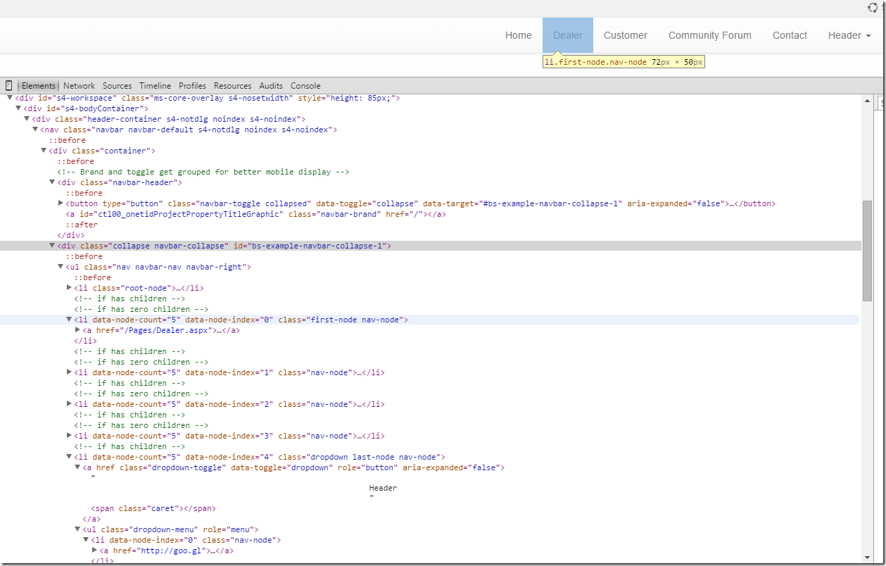
Take a look at how this renders, much better.

render

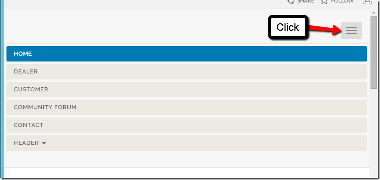
And when the screen hits the break point. It collapses and you have the mobile friendly menu. The break point is set in the bootstrap CSS (I believe it is 768px). The menu below is also

resp1

And the drop down

resp2

The Code Explained

You can skip this part if you don’t care what the code snippet actually does. I’ll break it down into parts to help you understand so you can make changes to it.

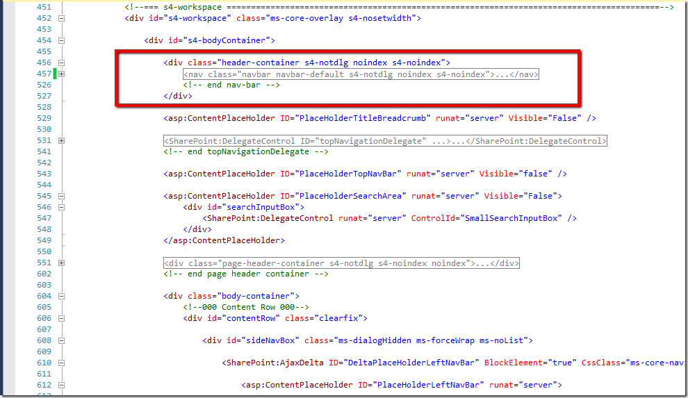
1) It’s up to you to determine where you are going to put the navigation inside your masterpage

In my particular case below I’ve created my own custom header where I put the navbar. I then turn the visibility off on the PlaceHolderTopNavBar (line 543)

ex

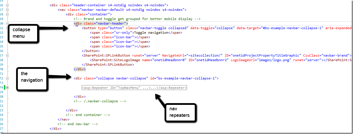
2) Looking at just the very high level bootstrap nav html

boot1

3) The Root Level Repeater

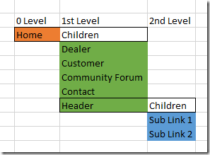
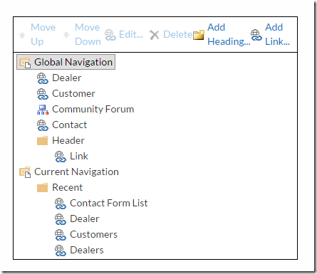
The first level I consider the root level. It contains the root navigation node typically “Home”. Below is the best representation of how the data comes back from the topSiteMap navigation provider. Each color is a level. The children of “Home” are the main level. This is similar to the OOTB, you might have seen the first node that isn’t in the navigation provider but just shows up anyway.

nav123 nav1234

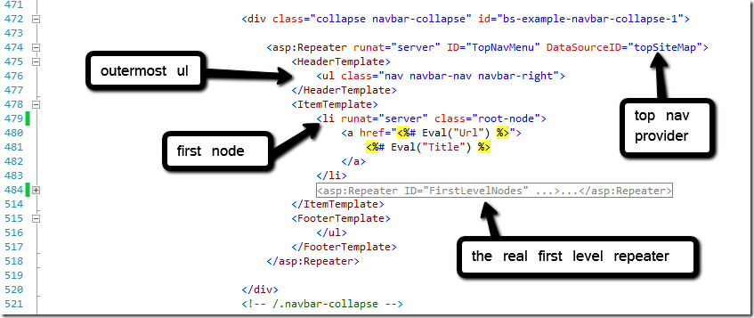
Now for the root level. In this screen shot you can see I render the root node then have a second repeater for its children nodes. The html is fairly simple for the first node and gets more involved for the next level.

zerolevel

4) The First Level Repeater

This level gets a bit more interesting because now we have two different classifications of nav nodes, with children and without children. We have to handle each a slight bit different and I’ll explain. If you have children we need to specify a different class to have a drop down. Next it needs a nested repeater to handle the next level (2nd level). If there are no children we can simply just render the navigation node just as we did with the root level. I use the ChildNodes.Count to determine which to hide or show. You might notice that the

  • ’s, line 487 & 507, have some other attributes like data-node-count and data-node-index and are REALLY long.  I’ll explain that in the next section.

level_one

4a) First Level

  • ’s

Let’s examine the first

  • the one with children. They are both the same except for the visible attr. We are going to focus on the following attributes, data-node-count, data-node-index, & class.

data-node-count – is not needed, but this will tell you how many sibling nodes are detected. I used this to help generate the if statements for class.

data-node-index – is not needed, but this will tell you the index of the node in amongst it’s current siblings. I used this to help generate the if statements for class.

a

class – this is basically a fancy edition I added which provides a first-node and last-node class. Again you’ll notice this one has “dropdown” in the class, the other

  • won’t because it doesn’t have children and doesn’t need a drop down.
    • The first node of a set will have the class=“dropdown first-node nav-node”
    • The middle nodes would have the class=”dropdown nav-node”
    • The last node would have the class=”dropdown last-node nav-node”
1 class=’<%# Container.ItemIndex == ((SiteMapNode)((RepeaterItem)Container.Parent.Parent).DataItem).ChildNodes.Count1 ? dropdown last-node nav-node : (Container.ItemIndex == 0 ? dropdown first-node nav-node : dropdown nav-node) %>‘>

5) The Second Level Repeater

The second level repeater code gets a little simpler. This is our last level and we don’t consider if the node has children or not. We just render the value of the node and leave it at that. If you wanted to go 3, 4 or 5 levels essentially it’s just copy what we’ve already done but I wouldn’t go more than 2 levels. Bootstrap 3.0 removed  support for multilevel dropdowns, citing usability issues as the cause.  You would be on your own if you decided to go for more levels. There are 3rd party plugins available to assist Bootstrap 3.0 with multi levels.

second_level

Known Issues

You expected everything to work beautifully, I know! But there is always a gotcha! when it comes to SharePoint.

The only issue with this method is that you loose the selected state of the navigation. This is easily over come with supplemental jQuery. You’re only other alternative is to convert this all to a user control (like I mentioned way earlier) and then in code what page you are on and add a class. I don’t have the reference to this method – but I’m looking. To be posted later.

Here is my jQuery work around – for highlighting the navigation for a selected node.

Download Script Here

1 $(document).ready(function() { 2 var nav = $(.nav); 3 if (nav == null || typeof (nav) == undefined) return; 4 5 /* Match navigation on current page */ 6 var url = window.location.href.toLowerCase(); 7 var decUrl = decodeURI(url); 8 nav.find(li > a).each(function () { 9 10 var href = $(this).attr(href).toLowerCase(); 11 var decHref = decodeURI(href); 12 13 if (decUrl.indexOf(decHref) != 1) { 14 $(this).addClass(active); 15 return false; 16 } 17 }); 18 });

Conclusion

That explains how I was able to utilize the SharePoint out of the box top navigation provider and build a new menu with ASP repeaters to behave responsively and work with Bootstrap 3.0. This is a simple enhancement that I’ve been re-using on many on of my On-Prem responsive projects. Unfortunately this doesn’t not work for SharePoint Online or O365 as the Masterpage does not allow code blocks. I’m curious if that’s with only editing pages by SharePoint designer, but what about deployed through wsp. http://stackoverflow.com/questions/22566589/sharepoint-master-page-asprepeater-tag . I hope to uncover an answer either way. Thanks for reading!

Office 365 Icons

Introduction

I recently came across an interesting blog – http://www.n8d.at/blog/office-365-icon-font-documentation/ which mentions O365 icons. This was back in February so when I attempted to locate these fonts so I could use them in some of my work. I could not located the file on the CDN that was mentioned. I kind of shrugged it off for a while but recently needed the icons again. So I went digging inside O365 and I found them. They are there if you want to use them. I’ll show you what classes to use. I also pulled the files which I’ll provide a link to at the end of the blog so you can download them and use them and not have to worry about CDN’s.

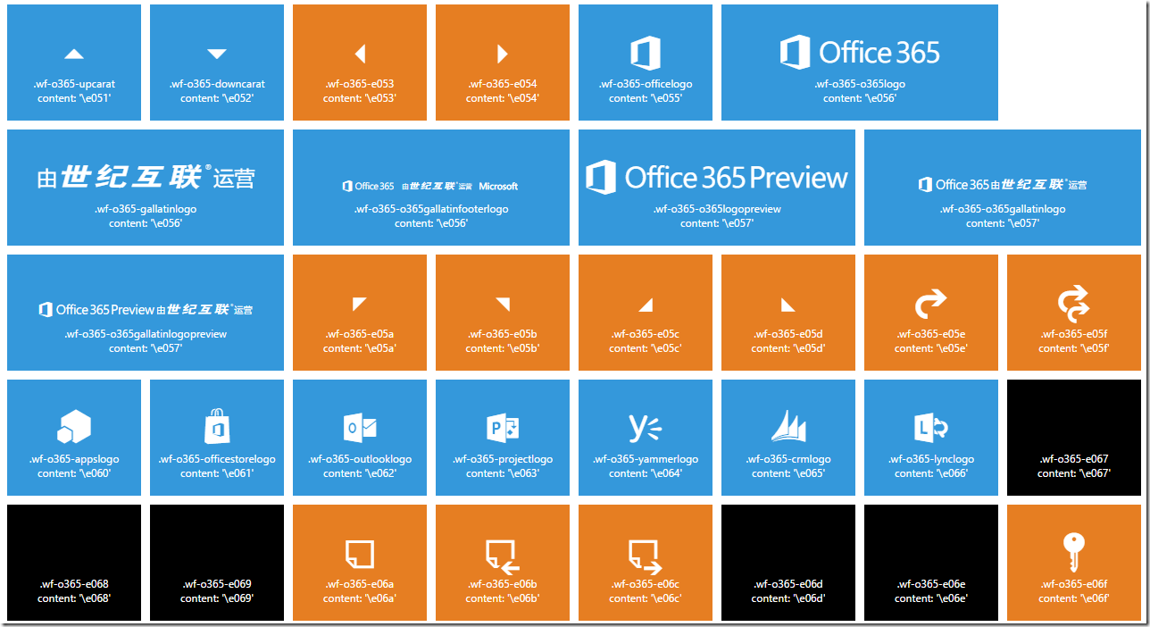
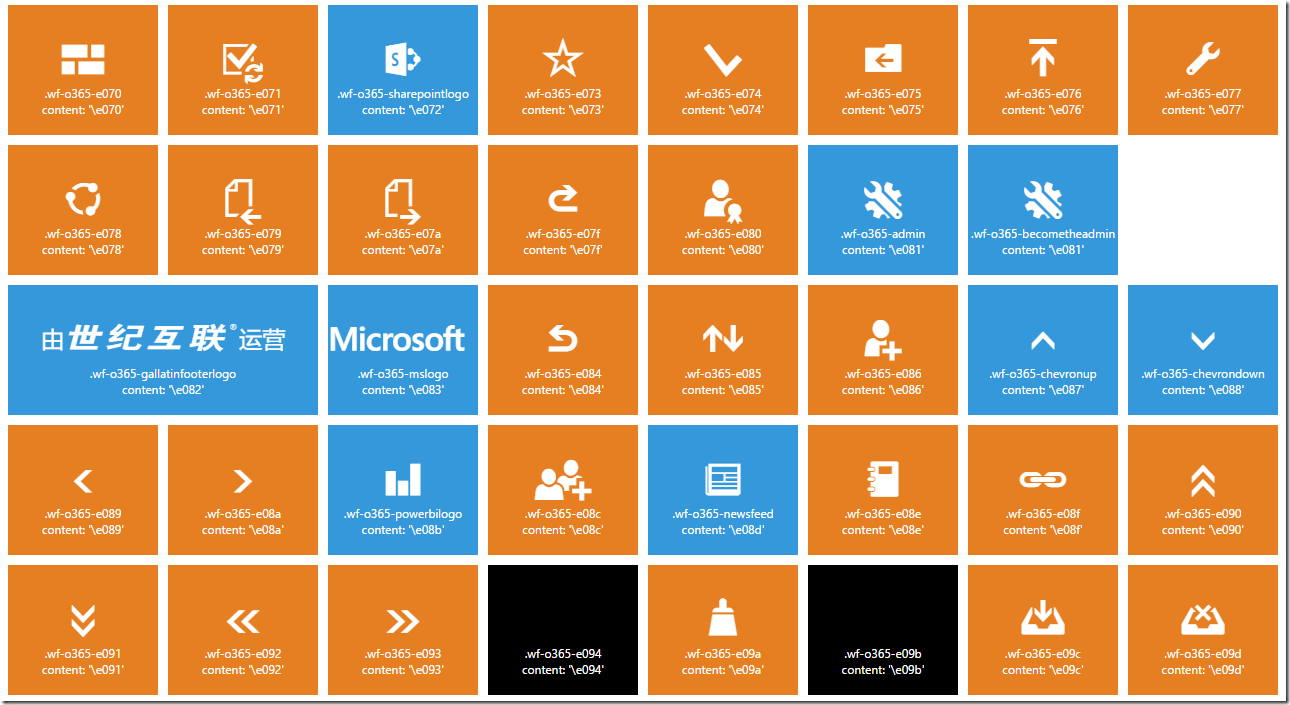
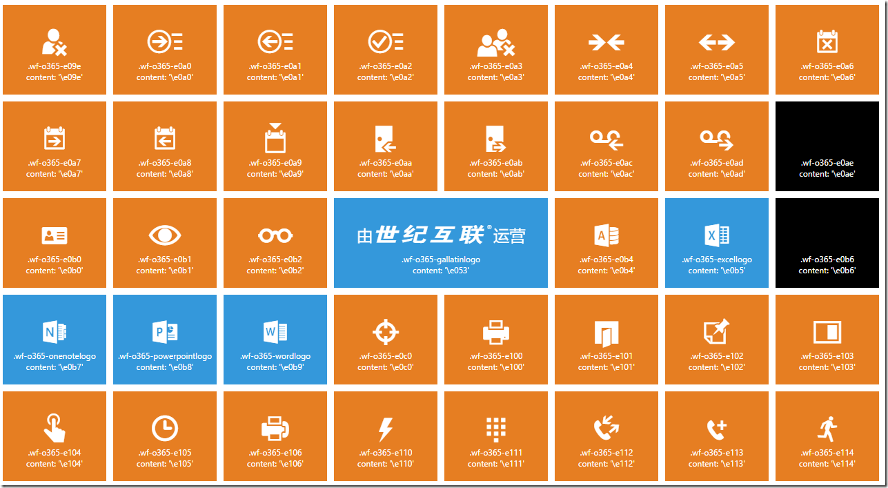
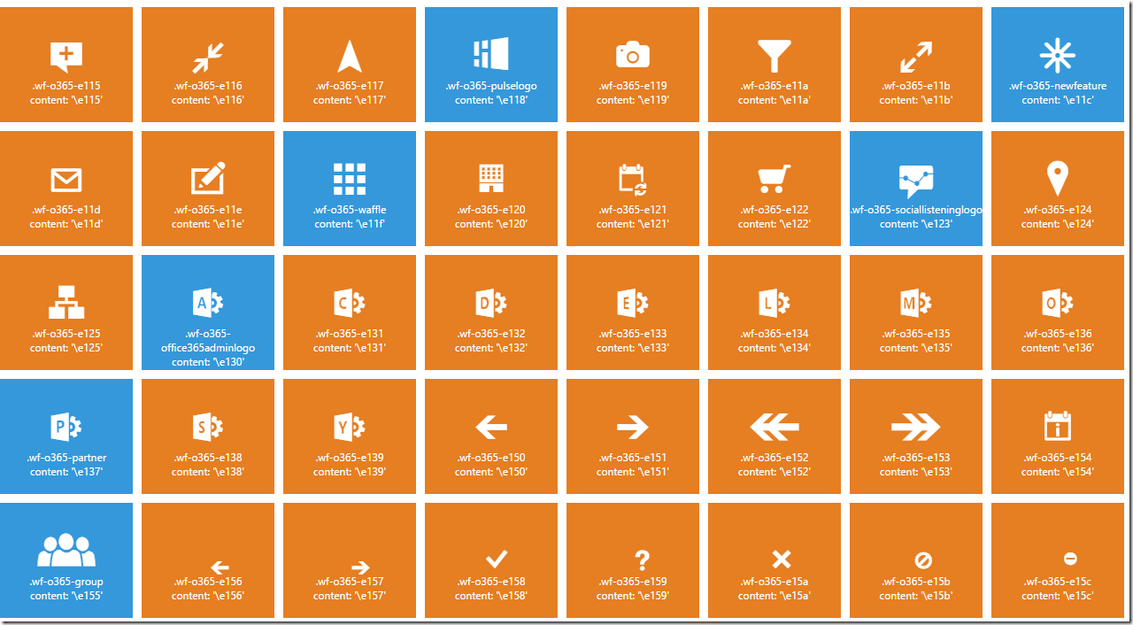
I found all the O365 icon inside my O365 Portal.  I downloaded the web fonts and a portion of the css file that has the code for the icons.  Using this approach you would be locked into the current icon. Microsoft is likely to continually update the icon & css, so this set would eventually become stale. If there ever is an official CDN I’d switch to that. If you’re on office 365 you don’t need to link to any fonts or css. You are able to just take advantages of the icons immediately you just need to look at my chart to see the classes or determine the code for the css content. If you don’t understand anything about using web fonts or what office 365 icons are, read the blog I mentioned above. That should bring you right up to speed.

Installation

    • copy the css & font folder to your on prem site
    • link to the css file in your masterpage or page (adjust path as needed)
      
      
  • you can implement one of the icons using something like this below
    
    
  • i have additional styles for color, font size, and spacing. view the source to check that out

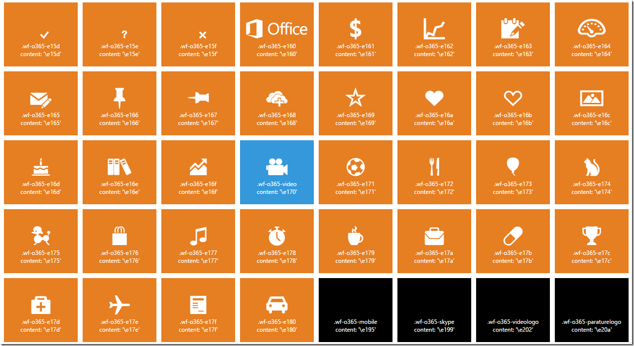
Explanation of the Grid

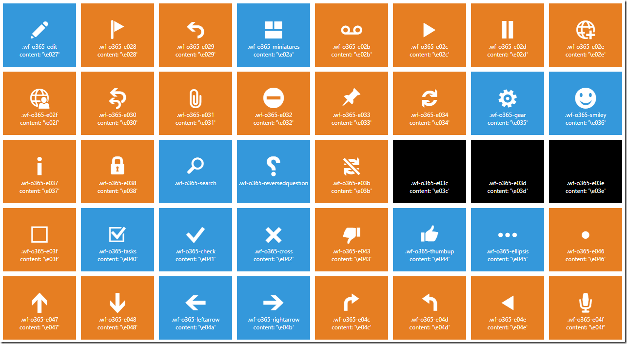
  • the orange tiles are icons that are available by using the css:after { content: ‘code’; } or if you copy the supplemental css above
  • the blue tiles are icons that have classes in O365. you can use those classes in directly on your o365 site without attaching any styles or fonts
  • the black tiles are dead, meaning they don’t show or are not in the font package but may be in the official css and have not been purged.

The concept of using fonts for icons is nothing new and if you are not exactly familiar with that check out Font Awesome or Glyphicons. The concept is that fonts will scale nice, the are light weight and fully loaded once when you hit the site. You can easily resize them and re-color them. No need for messing around with images.

Where I found the files

Fonts

https://outlook.office365.com/owa/prem/16.0.772.13/resources/styles/fonts/office365icons.svg

https://outlook.office365.com/owa/prem/16.0.772.13/resources/styles/fonts/office365icons.eot

https://outlook.office365.com/owa/prem/16.0.772.13/resources/styles/fonts/office365icons.ttf

https://outlook.office365.com/owa/prem/16.0.772.13/resources/styles/fonts/office365icons.woff

CSS

https://prod.msocdn.com/16.00.0791.004/en-US/css/shellg2corecss_f727a58f.css

Download Files Here

Screenshot of all the possible icons –> see full preview site above for a live example

1

2

3

4

5

6

7

8

Download Files Here

Thanks for checking this out

My Favorite JavaScript Libraries and jQuery plugins

These are a few of my favorite and go to JavaScript libraries. These tend to work well in SharePoint with no problem. This is my personal list that I use

Grid

Console Log

Glyphs

Carousel

Cookies

Click Outside

Mutate / Resize

Select Box (supports Multi)

Time / Date

Truncating Text

Layouts (masonry type)

Notify / Alerts

Modal

Scroll Bars

SharePoint Specific

Working with SASS style sheets in Office 365 / SharePoint 2013

My new favorite thing is creating all my style sheets with SASS. SASS makes writing my style sheets faster, easier, cleaner, and more reusable. Don’t ask me why I chose SASS, but I liked it just a little better than LESS even though they are very similar.  You can go do research for yourself and decide which you’d like to use.  SASS – http://sass-lang.com/ LESS – http://lesscss.org/.

SASS is nothing new however it is very difficult to work with when using with SharePoint 2010/2013 .. or Office 365. Why is it difficult? Because SASS needs to be compiled to CSS and none of your typical SharePoint tools do that.


Current Scenarios:

  1. If you are working on O365 you might be working with SharePoint Designer which won’t do anything for you.
  2. Maybe you have Visual Studio you can use Web Essentials or Mindscape Web Workbench. Both of these will compile the SASS to CSS
  3. You can use a stand alone compiler like Koala, Propos, & Scout (for Windows) … but configuring them to work can be tricky.
  4. You can use an online compiler – SassMeister | The Sass Playground! , but then you will be doing a lot of copy / pasting / uploading.


This article is going to show you how to use Sublime Text 2 on your desktop, to write and compile SASS, which will automatically be saved to O365. No copy / paste or uploading needed!


General Approach

  • Map network drive to O365 site
  • Use a desktop editor to create SASS
  • Use a desktop compiler to create the CSS
  • Use Scout to monitor CSS changes locally and copy file to network drive


Pre-Requisites

1. Java v7 – http://www.java.com/en/download [Scout has issue with any other version, https://github.com/mhs/scout-app/issues/173]

2. O365 Site


Step 1 – Install Sublime Text 2 & SASS Builder

1. go to http://www.sublimetext.com/2 and download and install

2. go to https://github.com/jaumefontal/SASS-Build-SublimeText2 (Follow Instructions there skip to step 3)

Installing Ruby

Install Ruby library (for windows) – http://rubyinstaller.org/downloads/

  • check box to add Ruby executables to your PATH

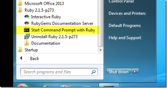
Start Command Prompt with Ruby
 image

In the console type the following

  • gem install sass
  • IF you get this error

image

Take a deep breath – you need to download the cert and add it to your RubyGem’s certificate directory.

image

  • go to that folder in windows in windows explorer
  • open up a subfolder rubygems\ssl_certs
  • copy the AddTrustExternalCARoot-2048.pem to the rubygems\ssl_certs
  • Retry “gem install sass” –SUCCESS!

image 

Installing SASS Build System

The easiest way to install this package is through Package Control.

1. Download and install the Package Control Plugin. Follow the instructions on the website

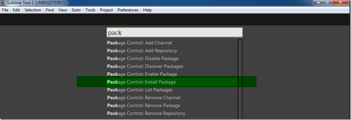
2. Open the command panel: Control+Shift+P (Linux/Windows) or Command+Shift+P (OS X) and select ‘Package Control: Install Package‘.
image

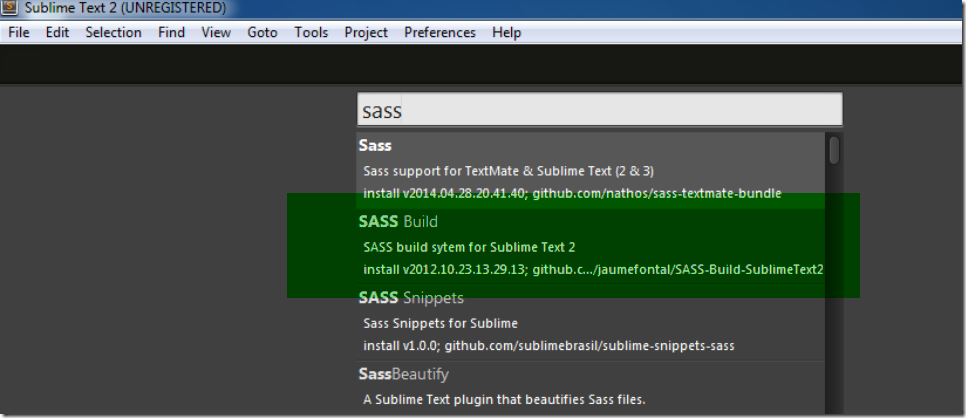
3. When the packages list appears type ‘SASS‘ and you’ll find the SASS Build System. Select to install it.
image 

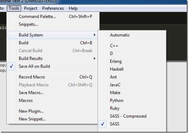
4. Set the Build System to SASS,  In Tools –> Build System –> SASS
image

5. Now you can compile your SASS files! Launch your build with Control+B (Linux/Windows) or Command+B (OS X).

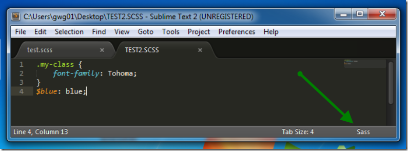
**NOTE** if you are not getting you are not getting colors on your SASS – click the bottom right corner and set the Language as SASS
image


Step 2 – Map Network Folder to O365

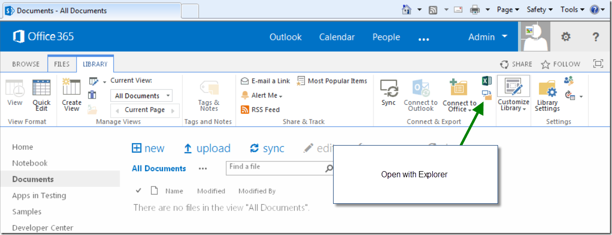
The key to this part is to first log into your O365 site w/ Internet Explorer. I then go to any folder and click the button to Open with Explorer. Then I can usually successfully map the network drive.

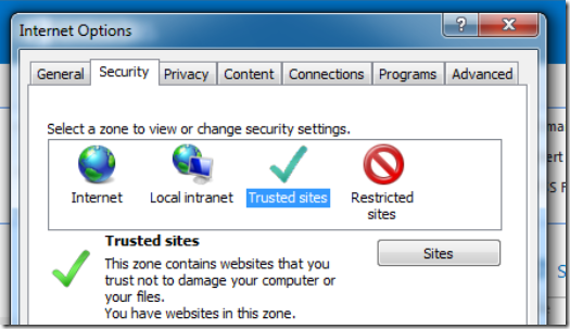
PRE-REQUISITES – Your site must be in the trusted sites. I actually add a few *.microsoft[sites] http://blogs.technet.com/b/sharepoint_made_easy/archive/2013/03/20/map-network-drive-webdav-with-sharepoint-online-o365.aspx

IE > Tools > Internet Options > Security > Trusted Sites [click sites button]
image 

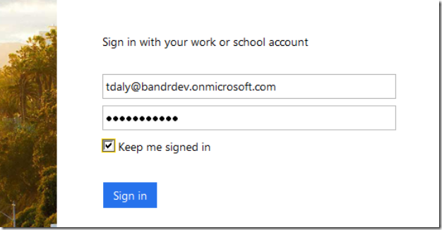
1. Log into your site with Internet Explorer – be sure to check ‘Keep me signed in’
image

2. Open up any document library [might look different. this screenshot from small resolution virtual machine]
image

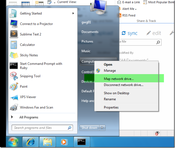
3. Next, do the standard map network drive per your Operating System. I’m running Windows 7.

basically right click on Computer and click Map Network Drive
image

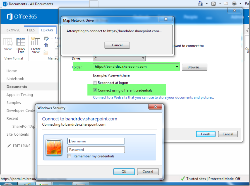
4. Enter in the site url w/ any subfolder you want [root is fine]. I also check connect using different credentials.

4.1 Enter in your O365 credentials
image

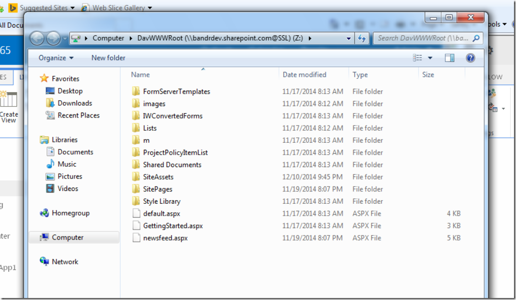
5. SUCCCESS !

image

Step 3 – Install & Setup Scout

For this you will need to create a local working folder for all CSS. for example I will create a folder on the desktop called ‘MySassExample’

1. Download and Install Scout @ http://mhs.github.io/scout-app/

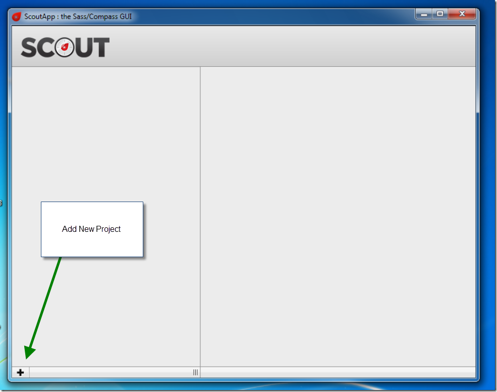
2. Once Scout installs, Open it up and click the + in the bottom left to add a new project
image

3. Navigate to your local working folder
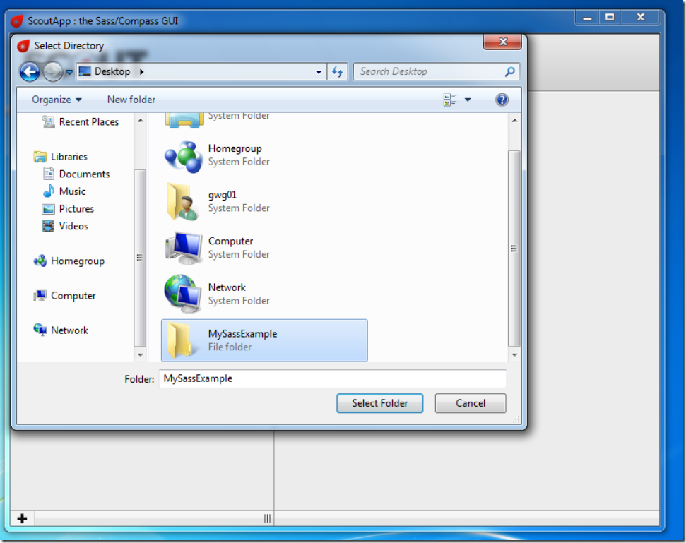
image

4. Under Configure, Stylesheet Directories –> set the Input Folder to your local working folder & the Output folder to your network mapped drive (o365)

I set it to output to the Style Library of my site.
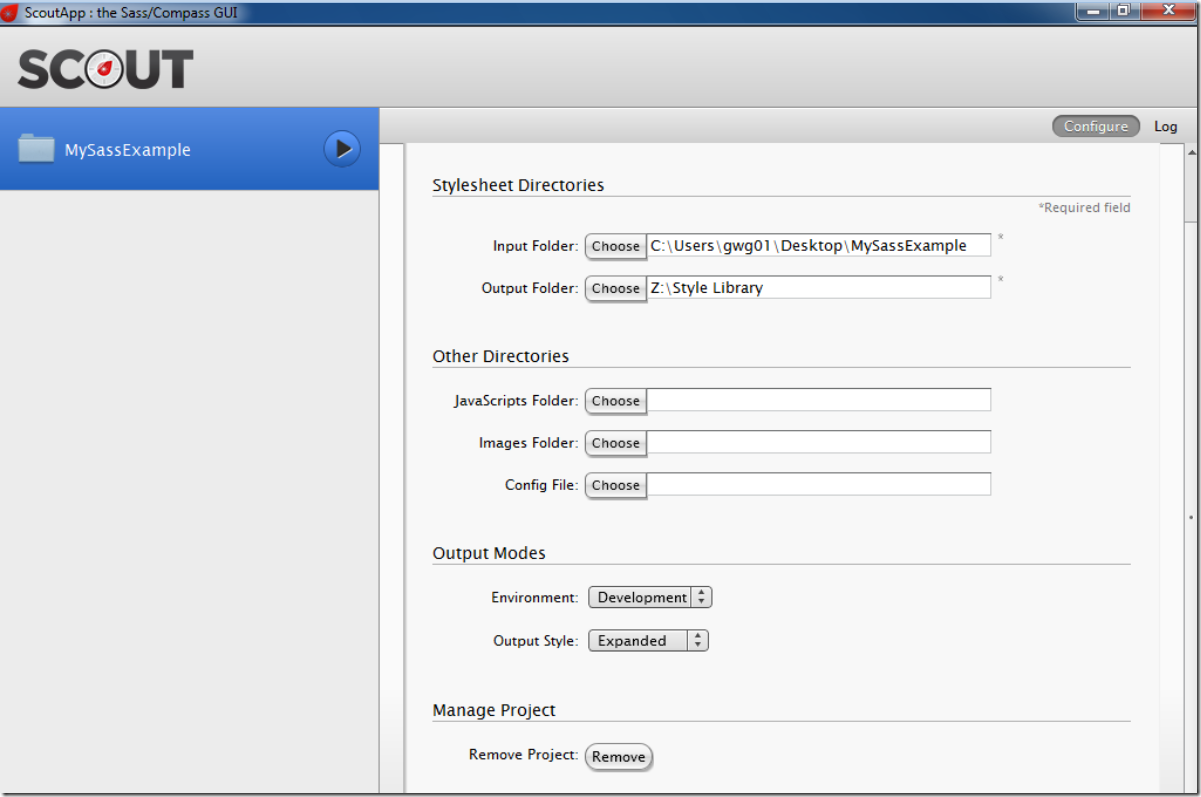
image

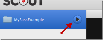
5. Click the Play Button

image


Step 4 – The Final Step, Verifying it all works!

1. With Scout running, Go to your local working folder.

2. Create a new .SCSS file or open an existing one in Sublime Text 2

3. Create some SASS
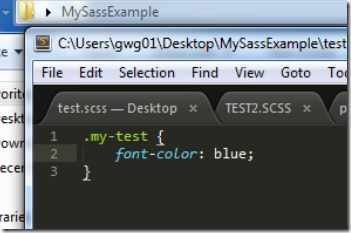
image

4. Save, then CTRL+B to build it. You should get the write ~file output.
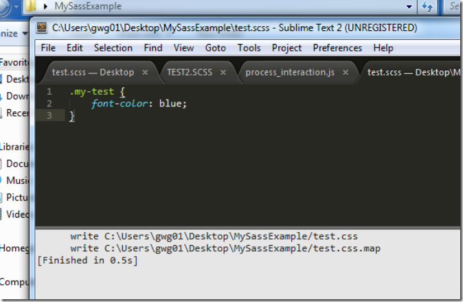
 image

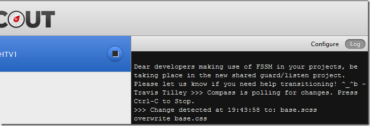
5. In Scout, you should see …. overwrite .css

Sometimes you need to give it a few seconds to save the file to o365, the network drive tends to take longer to save files
image

** NOTE if you are using an existing file make sure you check it out via SharePoint. Otherwise it won’t save and you’ll see errors in Scout when it tries **


Wrap Up

The concludes how to setup Scout & Sublime Text 2 to create and update SASS styles sheets which compile to .css and automatically push to O365. The hardest thing I found is mapping the drive successfully. There are many helpful articles on the different errors you might get trying to do so.  It may seen like a lot of steps to get going, but if you have used SASS or LESS before you know how powerful it is and how much time you might potentially save. This blog was meant to help get this setup and show you how you can get started. There are other programs like Scout, but Scout was the only one that I could get to work the way I liked. There are also other editors that you could use if you don’t like Sublime Text 2. Best of luck!


Resources

More on Scout – http://www.impressivewebs.com/sass-on-windows-with-scout-app/

Errors Mapping Network Drive – http://blogs.technet.com/b/sharepoint_made_easy/archive/2013/03/20/map-network-drive-webdav-with-sharepoint-online-o365.aspx

SASS – http://sass-lang.com/

Deploying Composed Look – The Declarative Method – Part 2

Back in December I posted a lengthy article on how to deploy a Composed Look for SharePoint 2013. If you haven’t read that it can be found here – https://tommdaly.wordpress.com/2012/12/19/deploying-a-custom-composed-look-in-sharepoint-2013/. In that article I described the two methods declarative and imperative. Given all the recent buzz around the deprecated sandbox solutions many of our clients are very anti code for their sandbox and online farms/tenants. I’ll keep this post short and sweet but this expands upon the declarative method.

Going back to my old post, I provided this excerpt of the elements.xml I used to provision the Composed Look to the Composed Looks list. You might wonder how did I get this, well I made a .wsp via Design Manager, renamed it to .cab, and extracted the files. In there I found the elements.xml that was used to deploy the composed look. Using this I was unhappy because if you look closely below you’ll see some URLs in there. I’m not a fan of using URLs or hard coding ANYTHING. If you’ve been working with SharePoint a long time then you know that this is not always possible in their xml with data views, and provisioning. (yes there are hacks & work arounds but lets not go there)


So here is my new snippet of XML for the elements.xml file which is used to create the new list item. I’ve removed the URLs completed and replaced them with ~sitecollection. Alternatively you could use ~site if you just wanted the web URLs to be replaced. No matter what site you upload this to the master page, image, theme, fonts will be connected up properly and no more messy URLs. A few other fields have been cleaned up:

  • Removed HyperlinkBarUrl from <ListInstance>
  • Removed Description from <ListInstance>
  • Display Order Field simplified
  • Removed FileLeafRef Field
  • Removed ID Field – It will generate the next available, if you set this to 100 then then next available ID becomes 101 when adding another via the UI.

image

download this as file


I’ve found that deploying this twice it will NOT overwrite itself. So if you make a change you’ll have to delete the Composed Look via the UI and then redeploy. I don’t see any parameters which allow list rows to be overwritten http://msdn.microsoft.com/en-us/library/ms478860.aspx so this may be a limitation. It would be amazing to be able to overwrite itself for any changes.

My Sticky Footer Solution for SharePoint 2013–Pure JavaScript Solution

Last year I posted a blog article which described the issue with SharePoint 2010 and having a footer. Well similarly SharePoint 2013 has some of the same obstacles when adding a footer. If you are interested in reading more detail into the issue w/ 2010 then go here: My SharePoint 2010 Sticky Footer Solution.

It basically boils down to these 2 issues:

  1. If you just add a footer to your master page it will be displayed directly under the page content. On a page that has little content then the footer may show half way up the page.
  2. Alternatively if you try a pure CSS sticky footer solution it may not work correctly either because SharePoint uses the page height to calculate where the scroll bars will go (mainly due to the header / ribbon always being at the top).

[Update 10/9/2013] – Added code from Robert, to handle MDS type pages.

[Update 9/1/2013] – I noticed that these scripts do not work on Team Sites, this is due to the Minimal Download Strategy Feature that is enabled. Turn that off and this work perfectly fine. I’m still researching how to make the scripts how with that feature enabled.

I’ve also updated the code to use it’s own function to detect height. Padding (top/bottom) can sometimes throw off the size computations.

Link the script file

As you can see below I’ve hosted my file in the Style Library

<!-- Custom JS -->
<SharePoint:ScriptLink runat="server"
 Name="~SiteCollection/Style Library/js/stickyFooter.js" 
 Localizable="False"  LoadAfterUI="True"/>

The Footer Control

Simply add this div after s4-bodyContainer in the master page file.

<div class="s4-notdlg noindex" id="Footer">
&copy; My Footer Solution 2013
</div>

As you can see below an export of the DOM from the IE Dev Toolbar.

footer

Here below you can see where in the Master Page (based on seattle.master) I look for the id=”DeltaPlaceHolderUtilityContent” and you’ll see 3 </div> above it. I put it right between the 2nd & 3rd </div>

mp_footer

The Script File

Download stickyFooter2013.js Here

This script is a pure JavaScript solution which will work with a default master page. If you customize it then you’ll need to account for any differences. It basically adds the suite bar + ribbon + body + footer, and if that’s smaller than the viewport aka viewable area. It will expand the body by the difference so that they are equal.

This also operates in it’s own namespace so there won’t be any collisions

I also bind to the window resize event so if the size of the screen changes the ribbon should stay on the bottom.

sf

Enjoy!